When a client actually wants a bold brand that’s different from their peers…We dig it. Though, with a name like renegade.bio, we shouldn’t have been surprised. Renegade was looking for a new brand that would exemplify who they were, their values, and their mission to develop and provide access to preventative diagnostics to underserved populations who need them most.
Not Your Typical Rebrand
Creating a brand that’s part Scientist part Activist for an atypical biotech company
Client
- renegade.bio
Industry
- Healthcare
Expertise
- Brand Strategy
- Creative Direction
- Identity Design
- Brand Communication
- Web Design
Renegade is renegade. Passionate about making a difference, they launched during the COVID-19 pandemic after incubating in IndieBio. They’re led by Queer founders with roots in Bay Area activism. In our Strategy phase, a theme became clear: Renegade is equal parts Scientist and Activist.
The Mission boldly came to life:
We are a purpose-driven, LGBTQ+ led, Public Benefit Corporation, demanding better health, and healthcare for all people.
We defined brand messaging and delineated the company into Science and Reach:
Renegade Science is focused on developing novel diagnostics and partnering with innovative biotech firms to help identify and prevent diseases.
Renegade Reach creates pathways through our healthcare system for distributing diagnostics to people who need them most.
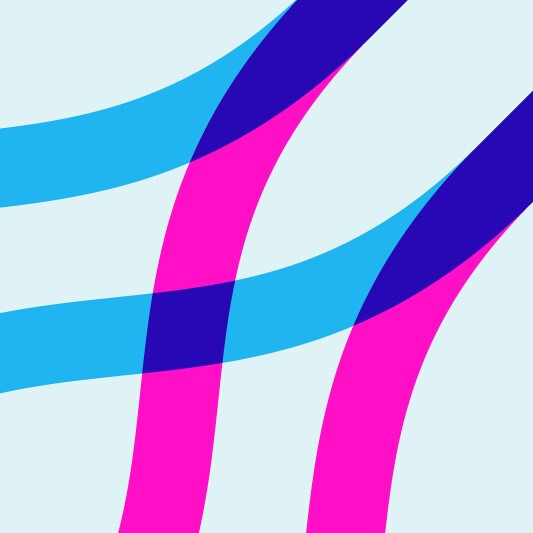
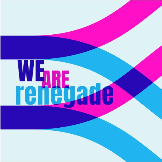
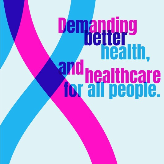
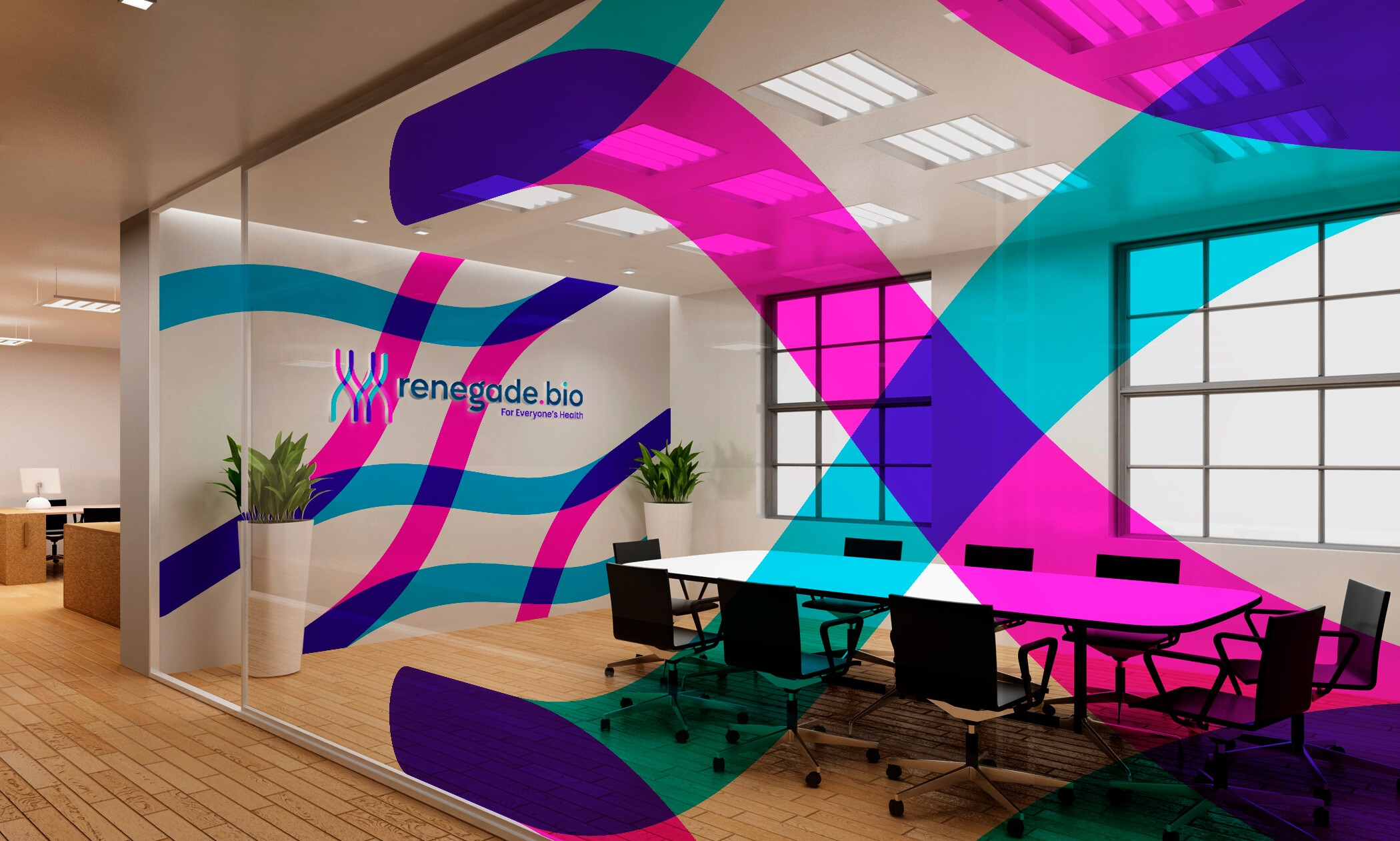
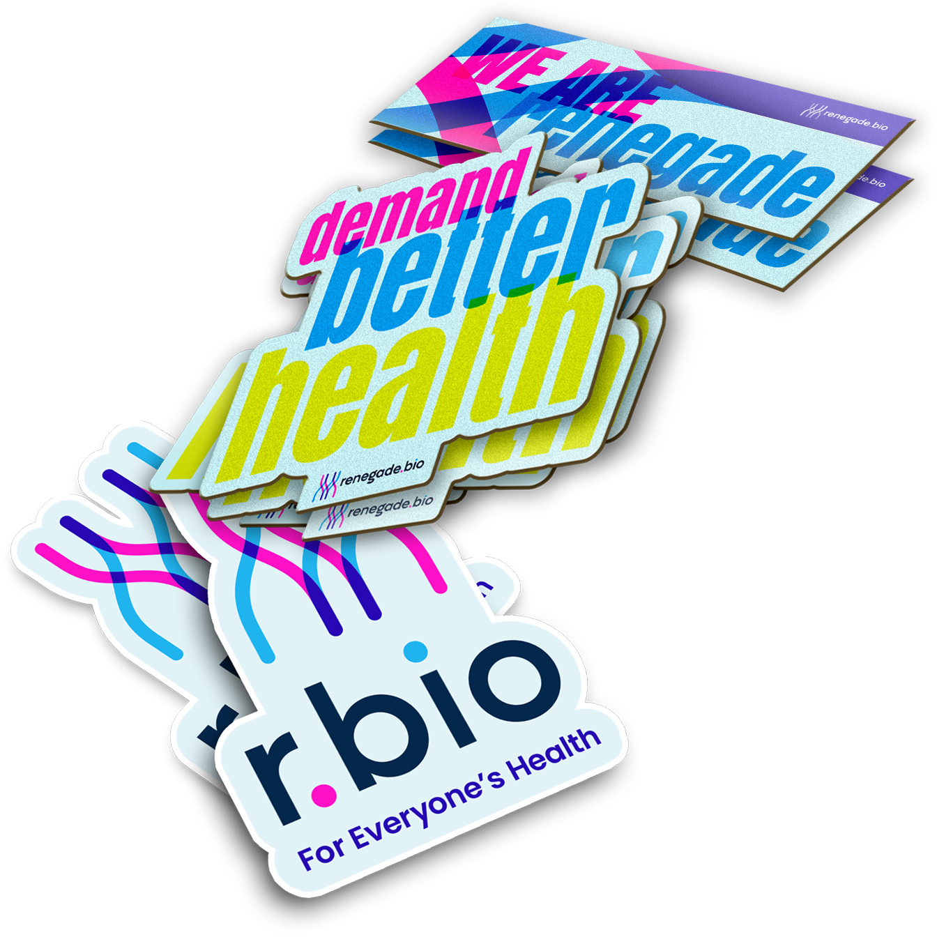
We visualized “science” and “reach” throughout their identity: The logo design references chromosomes, as well as pathways through the healthcare system. Science & Reach working in tandem. Our color palette feels like genetic sequencing, vibrant and fluorescent like the brand: Science is represented by blue, and Reach as pink; together, overlapping to reveal purple.
THE SCIENTIST & THE ACTIVIST
We created a risograph style for imagery and overlapping colors, nodding to the idea of communities coming together for a common purpose.
To develop custom icons that referenced healthcare - but still felt “renegade” in style - we worked with Francisco González y García to craft a dimensional look in their palette.
And just like the brand, when it came to designing and developing the website, it was equal parts Scientist and Activist – using bold messaging to drive home the Mission, and showcase the sides of the company within imagery and iconography.