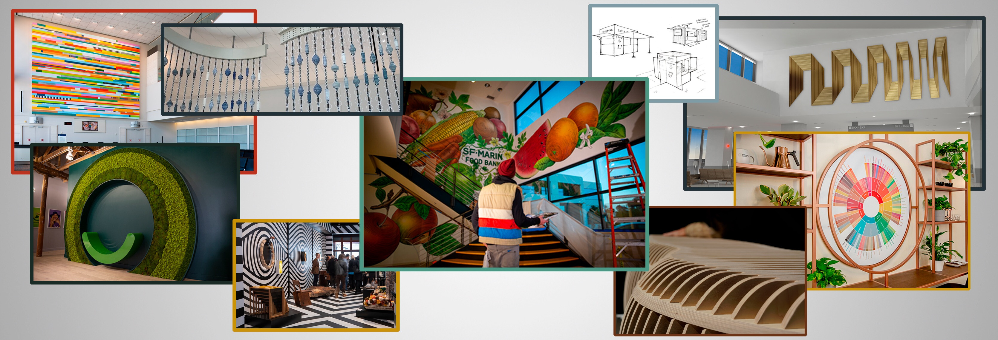
One Hat One Hand had been in business over a decade in San Francisco, building a strong reputation as a fabrication and installation shop. But they were ready to evolve into being equally-known for their design and creative skills, expanding their capabilities and reach across California. Time for a rebrand.
Many Hats, Many Hands, As One
Rebranding a 12 years-strong company in order to bring focus to their creative skills
Client
- One Hat One Hand
Industry
- Fabrication Design
Expertise
- Brand Strategy
- Creative Direction
- Identity Design
- Brand Communication
- Web Design
During our Discovery phase, we learned about the many talented artisans and craftsmen at the company; and we dug into the company name to understand what we could envision from a “Hat” and “Hand.”
Then we infused purpose and meaning into their name:
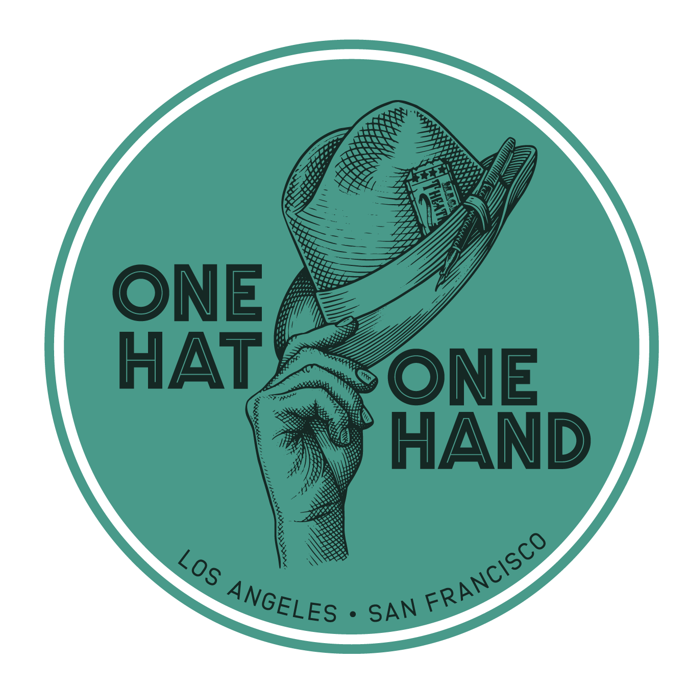
The Hat is all about Creativity. It represents concepts, ideas, storytelling, and design….The cerebral side.
The Hand is all about Craft. It represents skill, fabrication, engineering….Making brainy ideas a reality.
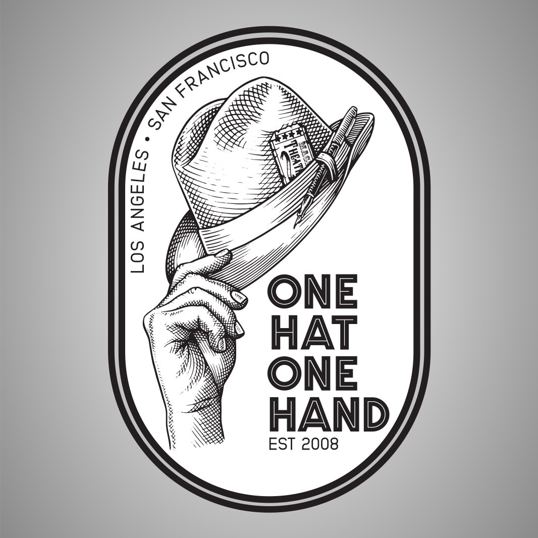
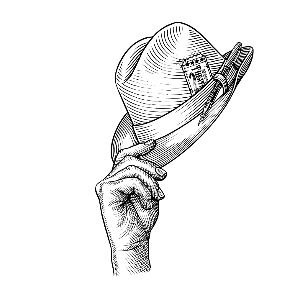
And we made a “tipping hat” a metaphor for how the company treats people: Showing gratitude to their team; recognizing talents and skills; greeting each new project with an open mind. We worked with tattoo artist Celeste Ciafarone to establish an illustration style that felt both handmade and specific, maintaining Creativity + Craft throughout.
WE TIP OUR HAT TO YOU
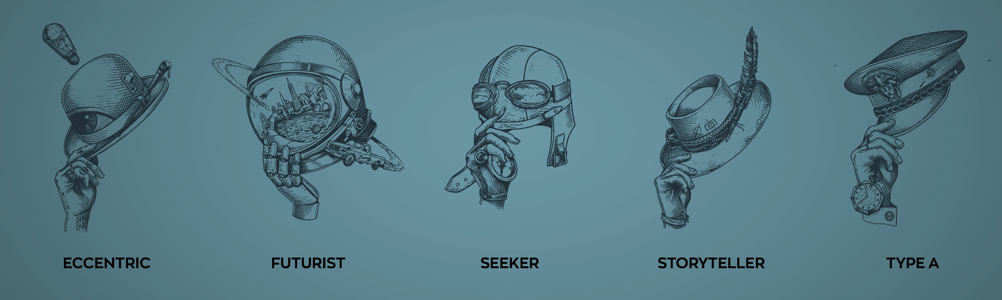
To visualize their philosophy, we designed five distinct Archetypes – representing the many hats and hands:
The Storyteller is about making with purpose, never art for art’s sake.
The Eccentric highlights the quirky ones, wildly-creative and unconventional.
The Futurist is anti-future-trash and forward-thinking and uses tech in new ways.
The Seeker reps skilling up, being ever-inquisitive, and learning.
The Type A shows OHOH cares about cleanliness, timeliness, and organization.
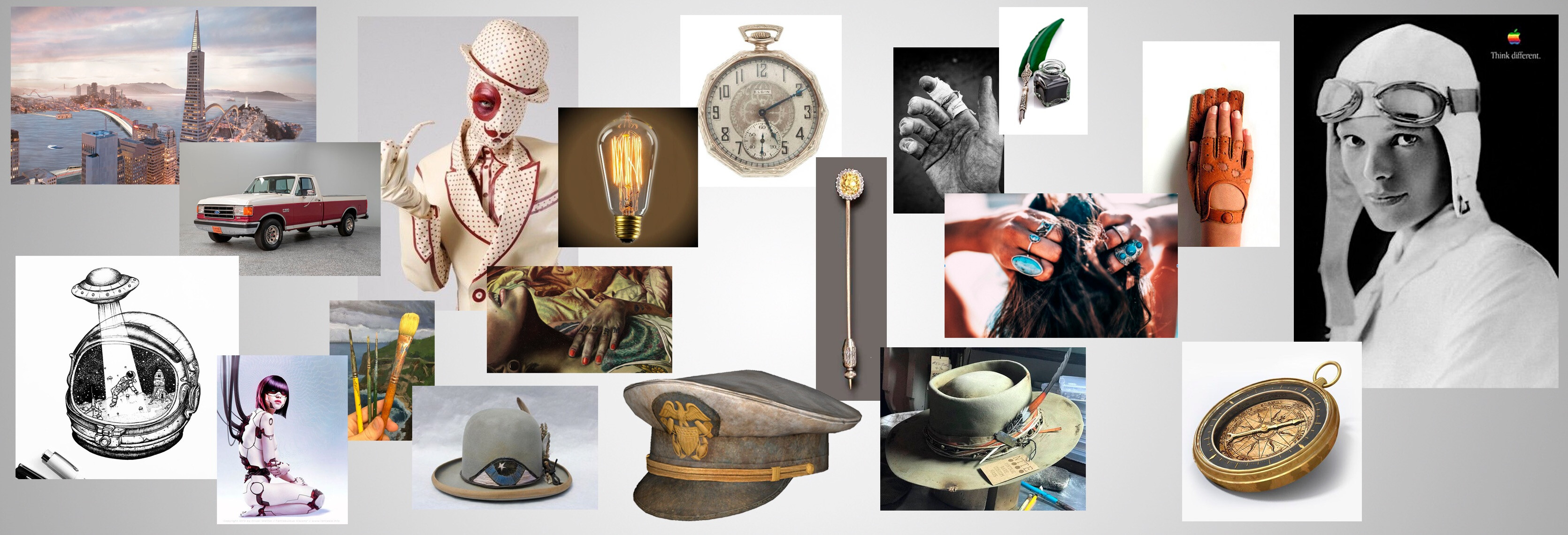
We sprinkled Easter Eggs throughout, pulled from our conversations with the team – some faves:
The “Bingo” written in the Edison bulb on The Eccentric refers to the very first art project they did…
The “Barney” truck on The Futurist is a nod to the company’s first truck…
And “ABK” on the hat of Type A means “Always Be Knolling” – a Tom Sachs reference to keeping your workspace clean.
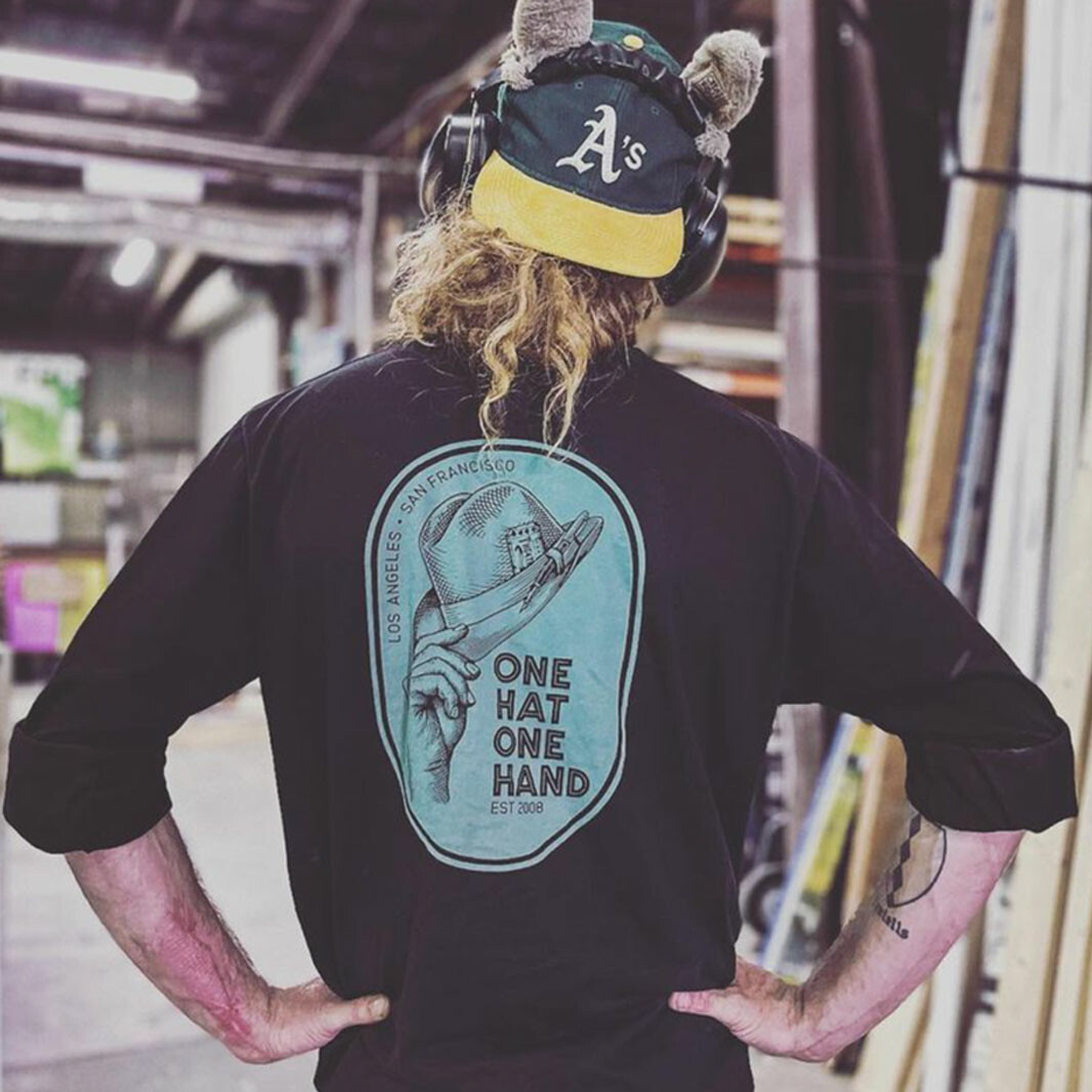
For their new website, we went bold with color and referenced pages of a book to show how they’re always aiming to tell a story with any fabrication or design; and we brought branding across various other touchpoints.
OH hey, that’s pretty clever.